2. One Table, More Than One Causal Story
Suppose a hospital introduces a new treatment for a serious illness.
After a year, there are records for 100 patients.
Half were in relatively good general condition when treatment decisions were made. Half were in relatively poor condition.
But the groups were not treated equally.
Among the 50 patients in good condition, 10 received the treatment and 40 did not.
Among the 50 patients in poor condition, 40 received the treatment and 10 did not.
The recovery pattern looked like this: among patients in good condition, 9 of the 10 treated patients recovered.
Let $T$ mean that the patient received treatment, $R$ that the patient recovered, and $C$ that the patient was in relatively good general condition. Then $\neg C$ means relatively poor general condition.
That gives:
$$ P(R\mid T \land C)=\frac9{10}=0.9. $$
Among the 40 untreated patients in good condition, 32 recovered:
$$ P(R\mid \neg T\land C)=\frac{32}{40}=0.8. $$
Treatment looks better within this group.
The same happens among patients in poor condition.
Of the 40 treated patients, 16 recovered:
$$ P(R\mid T \land \neg C)=\frac{16}{40}=0.4. $$
Of the 10 untreated patients, 2 recovered:
$$ P(R\mid \neg T \land \neg C)=\frac2{10}=0.2. $$
Again treatment looks better.
Within both health groups, treated patients recovered more often.
$$ P(R\mid \neg T\land C)< P(R\mid T\land C) $$
and
$$ P(R\mid \neg T\land\neg C)< P(R\mid T\land\neg C). $$
But something interesting happens when we ignore the condition the patient is in.
There were 50 treated patients altogether. Of these,
$$ 9+16=25 $$
recovered.
So:
$$ P(R\mid T)=\frac{25}{50}=0.5. $$
There were also 50 untreated patients. Of these,
$$ 32+2=34 $$
recovered.
So:
$$ P(R\mid\neg T)=\frac{34}{50}=0.68. $$
The aggregate comparison has reversed the result:
$$ P(R\mid T)< P(R\mid\neg T). $$
Among all patients together, the treated patients recovered less often. Such a reversal is called Simpson's paradox.
It is true that 50 percent of the treated patients recovered. It is also true that 68 percent of the untreated patients recovered. And it remains true that within each health group the treated patients recovered more often.
That leaves us with a problem the probabilities alone do not settle.
Suppose another patient now arrives.
Should the hospital expect treatment to improve the patient's chance of recovery?
The aggregate comparison says that treated patients recovered less often. The comparisons within the two health groups say that treated patients recovered more often. All of those probabilities are correct.
The causal question remains open: what would happen if treatment were deliberately given?
Simpson's paradox makes the problem especially vivid, but the problem is more general.
Probability theory tells us how the variables are distributed together.
For an intervention question, Pearl adds a way to represent claims about what can causally affect what.
Those claims can change which probabilistic comparison bears on the question we are asking.
A Small Causal Graph
Let:
$$ G=\text{general health}, $$
$$ T=\text{treatment}, $$
and:
$$ R=\text{recovery}. $$
Suppose doctors are more likely to give the treatment to patients in poor general health.
We can represent that causal claim with an arrow:
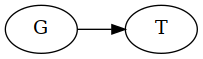
The arrow says that, in this model, general health can influence whether treatment is given.
It says more than that $G$ and $T$ occur together statistically.
We are claiming a direction of influence.
General health can also affect whether a patient recovers:
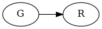
The model also includes a direct causal effect of treatment on recovery:
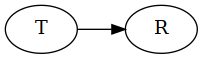
Together these claims give us a small causal graph:
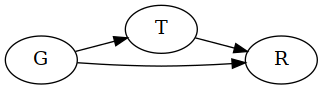
General health can influence both treatment and recovery:
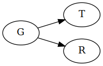
That helps explain why simply observing treatment can tell us something about a patient's health.
In our records, most treated patients were in poor condition:
$$ 40\text{ poor},\quad 10\text{ good}. $$
Most untreated patients were in good condition:
$$ 10\text{ poor},\quad 40\text{ good}. $$
So the two treatment groups differ in more than treatment.
That matters because our model also says that general health affects recovery.
The graph we have just seen makes the problem visible:
Patients in poor health are more likely to receive treatment, and they are also less likely to recover.
So part of the lower recovery rate among treated patients can come from who receives the treatment rather than from what the treatment does.
If this causal model is right, the aggregate comparison:
$$ P(R\mid T) < P(R\mid\neg T) $$
does not isolate the effect of treatment.
Under this causal model, the comparisons within the two health groups seem better suited to the intervention question. There, patients with the same general-health status are being compared, and in both groups the treated patients recovered more often.
The graph has given us a reason to favor that comparison for the causal question.
But that reason came from the causal claims represented by the arrows. The probabilities alone did not tell us that general health should be treated this way.
Another Causal Story
Now imagine that the same pattern of numbers arose in a different hospital.
This time the variable separating the two groups is not general health before treatment.
Suppose it is a biological condition measured after treatment, say blood pressure. Call it $B$.
The treatment can affect $B$, and $B$ can affect recovery:

Suppose treatment can also affect recovery in other ways:
The numbers could still show the same reversal.
Within each value of $B$, treated patients might recover more often, while treated patients recover less often in the population as a whole.
But the causal story has changed.
In the earlier model, general health helped determine who received treatment and also affected recovery:
Comparing patients with the same general health removed that difference between the treatment groups.
Here $B$ comes after treatment in the causal structure.
Suppose the treatment lowers the value of $B$.
And suppose a lower value of $B$ improves recovery.
Then one way the treatment can help a patient is:
Part of the treatment's effect on recovery travels through $B$.
Now imagine comparing treated and untreated patients only among people with the same value of $B$.
Within that comparison, we have deliberately removed the difference in $B$.
But in this causal story, changing $B$ was one of the ways treatment could change recovery.
So by holding $B$ fixed, we also remove that part of the treatment's effect from the comparison.
The within-$B$ comparisons are still valid probability comparisons, but they do not contain the whole effect we are asking about.
If we want to know the overall effect of giving the treatment, including whatever effect operates through $B$, then the aggregate comparison may now be the relevant one.
The numbers stay the same. What changes is the causal role of the variable we were conditioning on.
In the first model, $G$ came before treatment and influenced both treatment and recovery:
In the second, $B$ lies on a route through which treatment can influence recovery:
Holding it fixed removes part of the effect we want to know about.
Probability can tell us how treatment, the third variable, and recovery are distributed together. It cannot by itself tell us whether that third variable is a common cause, something produced by treatment, or something else.
The arrows add those causal claims. For an intervention question, they can change which probabilistic comparison bears on the answer.
What The Comparison Shows
Probability alone has not determined which comparison answers the intervention question.
The causal representation adds structure that can help with that.
Again there is the constraint produced once enough of the representation is in place. And there is the separate question whether that representation is convincing for this problem.